Taking Stock
09/05/14

18/02/14
13/02/2014


1/02/2014

10/01/2014
The painting is back in my room, rejected by the National Portrait Award but still one of the best pieces I've painted. I was quite relieved when I got it back and saw it, I still felt the pride I'd held when dropping it off. I think I might make it into a series about weight loss, all very honest and full of humor. Maybe one of me trying to do press ups, sit ups, lunges all very unflattering but far from ugly. Perhaps I can end it with one of me hiking, looking strong and happy but by no means thin. It could be a really good show if I painted them with the same subtlety of this painting.
I think I might be nearly finished! Today is all been about the frame and trying to find a way of doing it without it costing me a bomb. Me and Anna (the lady I'm living with) came up with a solution. Four relatively cheap bits of wood and nail it to the sides of the canvas. I will sand the wood down and colour it to match the painting itself.
On a side note I think I've found a new way of photographing the painting. Instead of simple adjusting the exposure I narrowed the aperture and extended the exposure from 4 seconds to 30. This made a much clearer and sharper painting.
13/02/2014
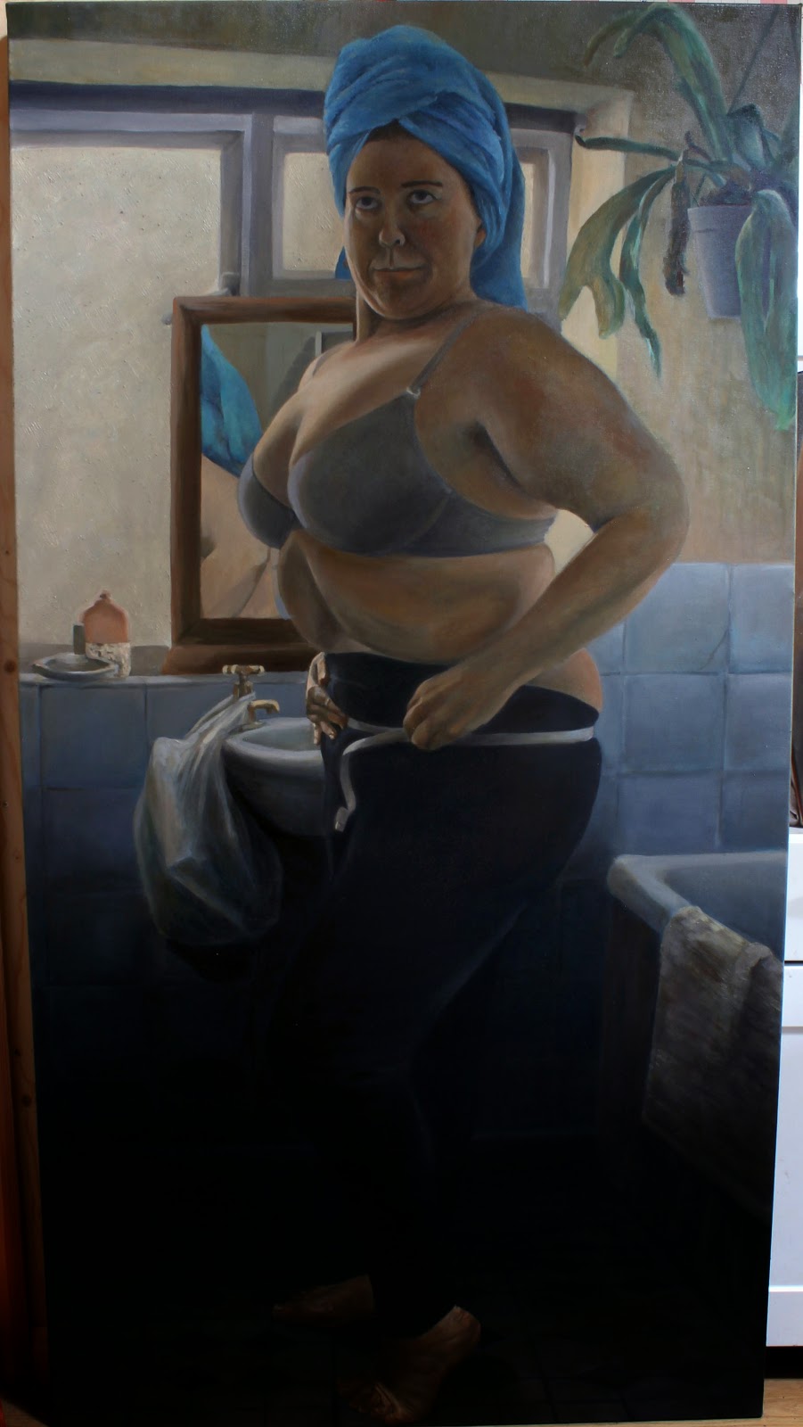
I think I've made a break through! I took the plunge and took the canvas off the frame. I've never done this before but I couldn't leave it as it was. The towel covering the feet hid from view what was wrong but didn't correct the mistake, just disguised it. The restretching, while worrying, went smoother than I'd hoped and an extra inch or so was added to the bottom of the canvas. I spent the rest of the afternoon priming the thin strip so that the paint would sit as glossy as the rest of the painting. There was an obvious line where the frame had been which I tried, with limited success, to sand down.
I decided straight after I drew these lines that I'd need to redo the tiles completely and align them with the visible ridge I'd been unable to sand down.
It still need a few more touches, the photograph isn't brilliant since the light it shinning too much off the wet paint but my gamble proved successful. She looks a lot more poised now, and her actions are much clearer. The glazes are working better, the skin shinning through but still requires a little more work.
03/02/2014
Mirror come back out the closet! I entered the national portrait award, I paid the scarily large entrance fee and I prepared to send my under average painting to them. But now, they don't want it. Instead I need to deliver it by the 13th of March to a location the other side of London. I have an entire month in which to make this painting the thing I want. I can slow down and really work it out so I present something that truly shows what I can do and not a pile of badly tones rubbish. I'm all excited again.
That said I'm giving myself three days off it so I can approach it with a much more detached and ruthless eye. Here is a proper photograph of the work.
Things that are wrong:
- The Face- to dark and lacking the regal plum humour I wanted to embue it with- oh and I hate my eyes in it. She looks half way through an action.
- The hands look okay in the photograph but are dirty, clumsy and unconvicing in real life
- The Feet- oww they are horrible but I haven't got a full lenght mirror and can't twist my ankle the right way- photography might be needed a little here
- Towel looks absalutely cartoony, at night time and rubbish
- Decide on a bloody colour scheme and go with it- I became far too liberal with my pallet and its not yielded good results
All considered a lot to do but I have a month in which to do it...I only began it a month ago so it'll mean it gets twice as much time spent on it.
1/02/2014
What a mess! I've been incredible fed up all day. The paintings due in tomorrow and I've made a complete pigs ear of it. It held so much promise and I go so excited but a mixture of rushing, impatience and bad lighting means I've wrecked what I had. The studio light isn't very bright and is very yellow. This means that when I finally finished it and placed it in the doorway to dry, ready to photograph tomorrow I realised that the skin was the colour to a beetroot and the tonal balance was awful. Whats more the colours were dirty and smudged.
I'll have a better stab and photographing it tomorrow and then decide whether submitting it would be nothing more than a waste of money. Perhaps I should consider entering the Manet transcription instead. Either way my hopes of been shortlisted had disappeared. Got me into a mood and I ended up spending the rest of the day stretching and priming canvases, and putting off painting anything which I might wreck. I did however get a lot of computer applying done, as well as adding works to online galleries so the day wasn't completely wasted.
10/01/2014
Its been a very busy two days, worked twelve hours each day and I have made some progress but I really need to sort out the priming problem before continuing. Apologies for appalling photography but it was a simple grab and shoot before bed for the records. Its sufficient to give an impression of what I'm talking about. As you can see I've solved the foot dilemma but simple covering it with a towel and hoping no one notices. We shall see.
 |
| Side shoot of painting- poser sucking in her breath to tuck in her stomach |

I'm trying for a very subtle colour scheme, plainly between tonally similar shades of yellow ochre/brown and blue. with the face I've looked at a lot of the colours Jonathan Yeo uses in his work:

Its all very dull tones of greenish yellow and looks nothing like human skin on the pallet yet it works wonderfully for him. It took for me to commit and take a plunge but I can believe it no and will mean a massive step forward in portraiture if I can master and adapt it to my pieces. His work has strokes of beauty and mastery but also is in part very dull and cheats. The affect of leaving the canvas blank serves to throw his painting into very flattering light- it contrasts the flat service of the roughly primed canvas with the vividness and vibrancy of the two dimensional image he's created. If he was a true master of painting this cheat would not be needed and he could highlight the figure in a complex surrounding. That said he's miles ahead of me and still young. Need to get working on my portraiture techniques.
09/01/2014
Finally finished sketching out the painting and put on the first layer. It was painful. I kept on making myself a square or so lighter than I meant to. Some sort of subconscious attempt to make myself thinner I think. Compositionally I think its working although I'm a little worried about not having primed the canvas enough. Such lazy unprofessional mistakes are pathetic. Speaking of which, after I drew the graph I realized I'd measured it wrong and chopped off two inches off my eight. This is shaping up to be quite a shoddy job.


06/01/2014
I have less than a month before the application deadline for the National Portrait Prize and I haven't even started. I have today to draw up some sketches, tomorrow to play around with poses and colour schemes but I want the entire first layer in a good state by friday. These are my primary sketches:

What am I thinking about?
- What is going in the background? what is it saying and how will it serve to unify the piece?
- How is the shadow falling and what is the most prominent?
- What is the tonal balance?
- How necessary is it for me to be exactly live size?
- What clothing? What is the narrative?
I do want it to be comical but also vulnerable and intimate. Tomorrows photographs will help me plan it out more exactly before relying more heavily on a mirror. I want them to look at the painting and smile as well as sympathize but admire the figure. The flesh needs to pop and the textural. I cannot shy away from painting the fat with accuracy and tonality.
The other competition I want to enter is the Winter Pride open exhibition in a week or so time. For that I wanted to refresh and remaster my Lissie and Esther painting and finally correct the many elements which have upset me about it.

So, whats wrong with it?
- Background isn't working, block it out completely and have a anonymous light source.
- Complete lack of texture in it all, needs veriety.
- Correct the body distortions in Lissie, and make her expression a little more elegant and vivid
- Keep pastel tones of early morning, a misty uncertain morning
- Capture more of the sense of them been squashed in together
- Bring out the cerulean blue of the blanket, make it glisten


Comments
Post a Comment