Kids painting- follow up
30/10/2013
Window was wrong, blanked it out last night over the course of fifteen minutes and its definitely better without and, like I mentioned on my previous post, by copying Caravaggio the whole thing is working a lot better.

09/07/2013
After three people asked me politely where the light source came from I gave up and tried placing the window back. The original window I still hated but something was obviously needed. Since I'd gone for extreme shadows I decided an entire window was too much. I placed, instead, a thin stream of light flowing through drawn curtains, shinning light only on my central figures and casting everyone else into shadow.
However, as I paste it on this page, I can see very clearly that its till not right!!!! The curtain is off and the lines of the window don't quite match the floor. Damn!

The painting I looked at most while working on this was Caravaggio’s 'Beheading of St John':
![[Michelangelo_Caravaggio_021.jpg]](https://blogger.googleusercontent.com/img/b/R29vZ2xl/AVvXsEitH5n3Zv9pOm7uXZ9aEuiUCHDAMQ2UeP97Scj8dAMqGsuBXFAeAUBts4sArC4XHvur1oMqaPDVuMj2GLjprOxpCuFAMBSb51x_lIhgDZIl7Tq0rP2gsp4r94_BYKOO6p4YRXX9GuzES3rQ/s640/Michelangelo_Caravaggio_021.jpg)
When me and mother got into another debate on the light source I produced this painting to argue my point. I demanded off her to show me the light source, but when she very concisely replies "we are" I realized she was right. The spotlight is from the viewer, almost like a flash of a camera and ruined my entire argument. A better painting to look at would be the 'Calling of St Mathews' :
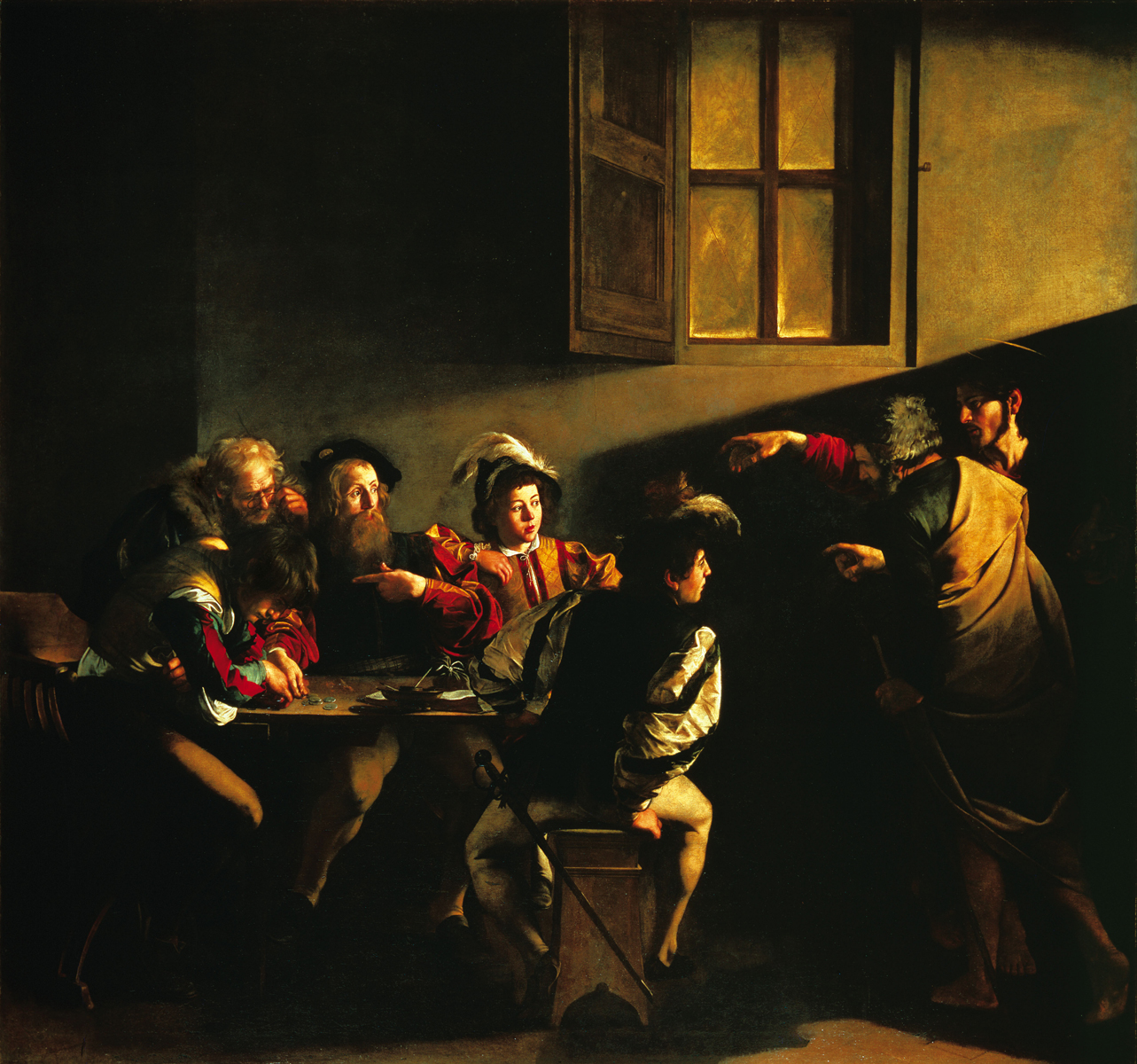
I think what I need to do is go away, keep it in mind, and return after a month or two and some perspective. I'm too precious with is at the moment, too worried I'll ruin a lot of hours of work. But this is the painting to study and consider. See how sharp the lines of shadows are, how certain the artist is that he is right. Most of might shadow and light is experimental and very hesitant.
25/07/2013
I'm still working on it but here is how the kids painting is looking at the moment. Still need to adjust certain features but I'm happy with how its going. It was a big improvement when I took out the window. Although the window suggested a light source to the viewer it also detracted from the light which was shining on the figures:
The light still isn't as striking as I'd like, I need to somehow emphasize the light even more without making the rest too dark. Have another go tomorrow.

11/04/2013
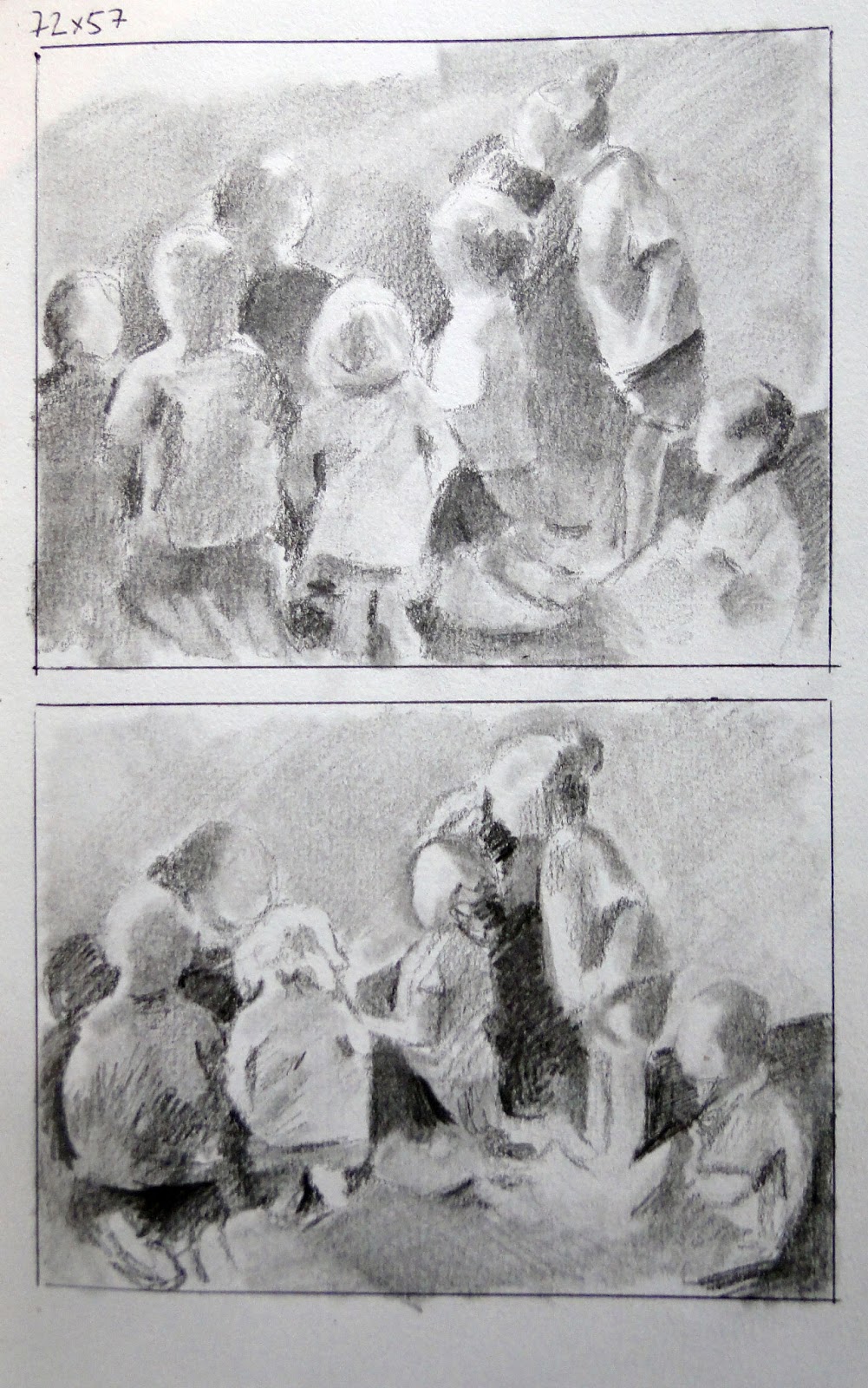
Just starting a piece based my travels, in particular reading time when I was working with two year olds in Israel. From now on I plan to blog my painting journal, so you'll see a lot of really rubbish pieces but it will be an honest narrative of my practice.Here I've posted the plans for my painting 'Reading time' :
 |
| Compositional sketches |

 | |||||
| Final gritted plan |
 |
| Penned outline on canvas |
When I'm sketching the rough plans I'm not after a finished drawing but a series
of shapes that fit together and comfortably fill the space. This allows
me, without thinking too much about it of wrecking the piece, to move figures around until
they work and bounce off each other.
Once I found one I liked I
enlarged the drawing and worked harder, detailing the tones as well as
the figure placement. Then I pen out the outlines on a grid, to later
help me enlarge it to canvas, and do one more tonal plan. I want it
fixed in my mind the light source and the focus of the piece.
 |
| First layer - Four hours through the paiting |


Comments
Post a Comment